
What Is a Good Cold Email Reply Rate? (And Why Every Source Disagrees)
Good cold email reply rate: ~2–3.5% per contact bulk, ~5–8% when tight. Published averages disagree on denominators—normalize any vendor claim here.
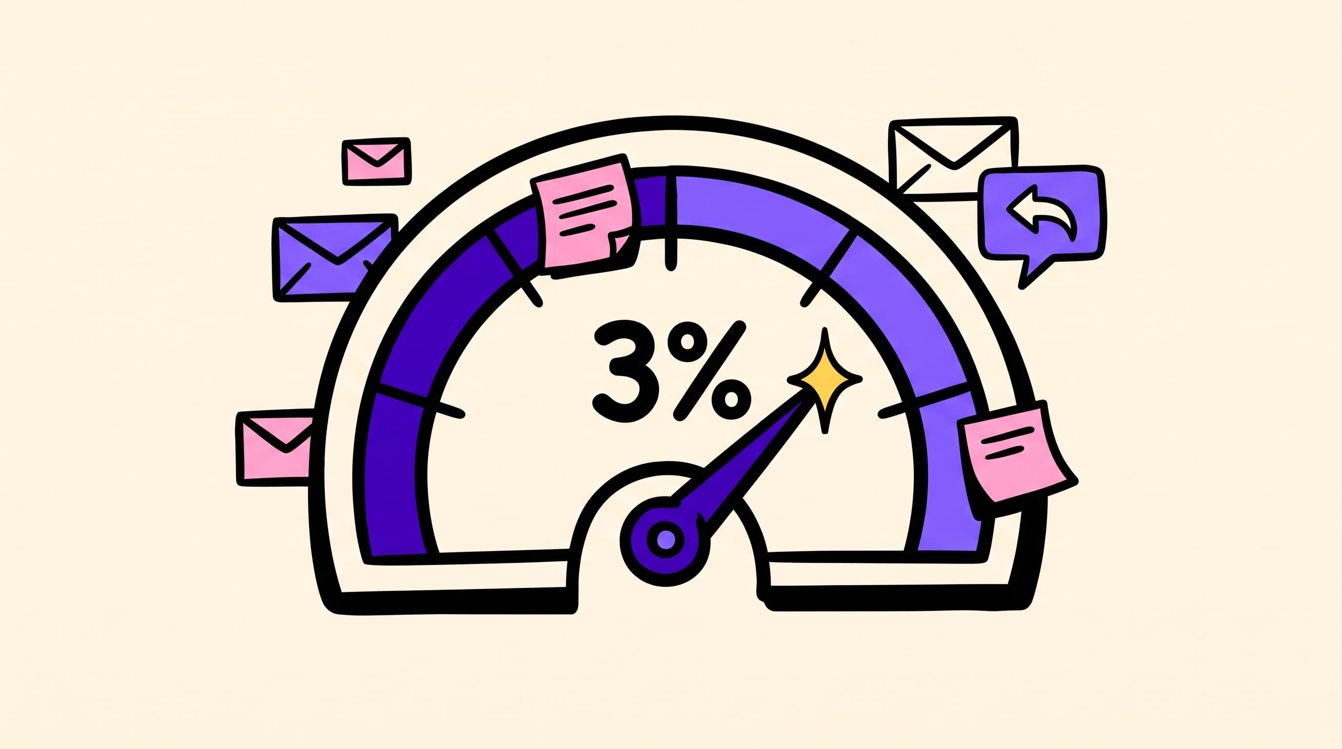
A good cold email reply rate in 2026 is roughly 2–3.5% total replies per unique contact for bulk B2B outbound, ~5–8% when targeting and deliverability are tight, and 10%+ only on narrow or signal-led lists. Published “averages” swing from ~2% to 8%+ because vendors divide by different things. Always ask what they put in the denominator before you compare their number to yours.
That single question — what did you divide by? — is why every “average cold email reply rate” page on the internet seems to disagree. Instantly’s 2026 platform report lands near 3.43%. ReachIQ publishes a 4.8% median. Sales.co’s 2M+ email study reports 2.09% per unique contact. Belkins’ 2025 cut (still widely cited in 2026 roundups) sits at 5.8%. None of those figures are “wrong.” They are answering slightly different math problems. This page gives you the arithmetic to normalize any vendor claim, then states Ken’s own book-level number with its denominator in the open.
For the full multi-metric picture (bounce, meetings, positive share, inbox placement), use our Cold Email Benchmarks 2026 pillar. This spoke stays on reply rate only.
What is a good cold email reply rate?
Use tiers against unique contacts emailed, not against every send in a multi-touch sequence:
| Tier | Total reply rate (unique contacts) | How to read it |
|---|---|---|
| Broken | Under ~1% | List, inbox placement, or offer is wrong — fix infrastructure and targeting before rewriting subject lines |
| Typical bulk | ~2–3.5% | Matches most large platform averages published in 2026 |
| Solid | ~5–8% | Tight ICP, real personalization, working deliverability |
| Elite / signal-led | ~10%+ | Narrow segments, strong triggers, or warm-adjacent context — not a fair bulk baseline |
Ken’s book-level operating average is about 3% total reply rate, with about 30% of those replies positive. That is what a full stack — verified lists, owned sending infrastructure, human-led copy frameworks, and AI personalization with human QA — produces at volume (1M+ emails/month) when the offer and audience are already sane. It is not a promise for every niche on day one.
A “good” number is also context-dependent. A 2% reply rate into enterprise finance can be excellent. A 2% reply rate into email-native SaaS founders with a verified list usually means something upstream is soft. Benchmark against your ICP and sequence design, not a single blended internet mean.
Why do published reply rates disagree so much?
Four choices quietly rewrite the headline percentage:
-
Denominator. Reply-per-contact and reply-per-send are different metrics. A four-touch sequence on 1,000 contacts is 4,000 emails. Divide replies by sends and you cut the rate by roughly the sequence length. Divide by unique contacts and you measure what operators actually care about: how many people responded.
-
What counts as a reply. Some vendors count every human reply. Some exclude “not interested.” Almost none exclude out-of-office and auto-replies unless they say so. Sales.co’s 2026 analysis of 2M+ emails found 45.1% of replies were auto-replies — nearly half a raw “reply rate” can be machines talking to machines.
-
Positive vs. total. A 5% reply rate with almost no interest is worse than a 2% reply rate where a third of replies want a call. Positive reply rate is the number that predicts meetings.
-
List tightness. Roundups repeating Belkins-style cuts show campaigns under ~50 recipients averaging ~5.8% reply versus ~2.1% on lists of 1,000+. Blending those populations into one “average” is how you get a number that describes nobody.
If a page will not disclose those four choices, treat the figure as marketing, not a KPI you can manage to.
Is reply rate measured per contact or per email sent?
Prefer per unique contact for operator decisions. Prefer delivered over sent when your tool supports it, so bounces do not masquerade as a copy problem.
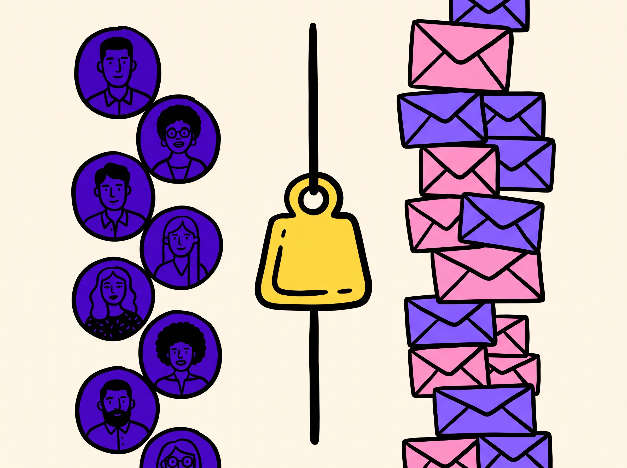
Per contact vs per send: the same campaign can look 4× “worse” if you divide by every touch.
The normalization arithmetic
When a vendor publishes a reply rate without a denominator, reverse-engineer it:
reply_rate_per_contact ≈ reply_rate_per_send × average_touches_per_contact
Example: a tool reports 1.0% reply per email sent on a 4-email sequence. If nearly every contact got all four sends, that is roughly a 4% reply-per-contact story — not a 1% program. The reverse also holds: a 4% per-contact campaign on four touches is about 1% per send.
Also normalize:
| Adjustment | Why it matters |
|---|---|
| Sent → delivered | Drop hard bounces from the denominator |
| All replies → human replies | Strip OOO / autoresponders when the source allows |
| Total replies → positive replies | Meetings track interest, not “stop emailing me” |
| Single-touch → full sequence | Single-send studies understate multi-touch programs |
Ken reports reply rate per unique contact, total replies first, then positive share of replies separately. That is the pair that survives a board review.
What is a good positive reply rate?
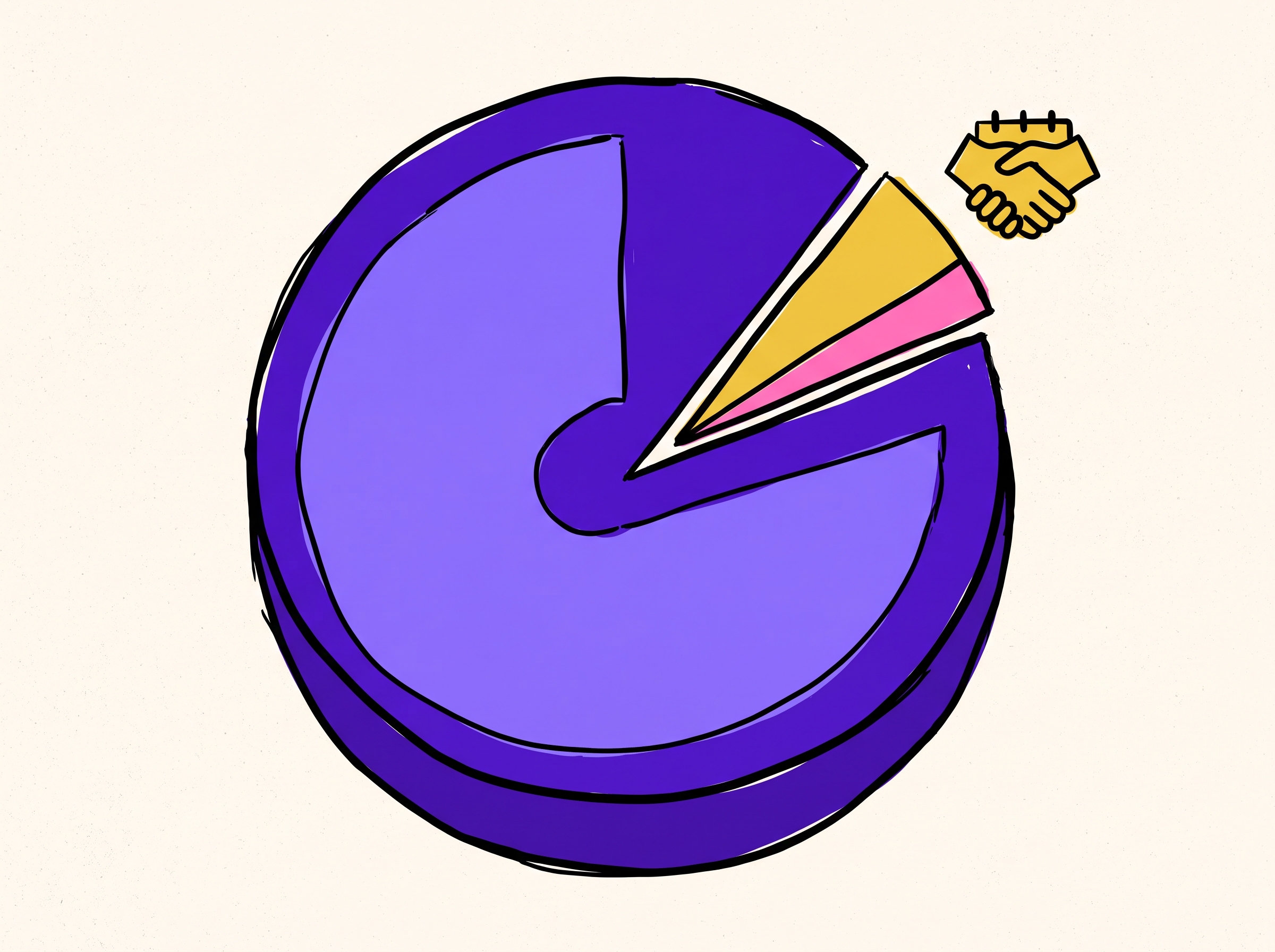
Total reply rate without positive share is an incomplete KPI.
Track two numbers, never one:
| Metric | Definition | Ken book-level reference |
|---|---|---|
| Total reply rate | Any human reply ÷ unique contacts | ~3% |
| Positive share of replies | Interested / next-step replies ÷ all human replies | ~30% |
| Implied positive rate | Positive replies ÷ unique contacts | ~0.9% (3% × 30%) |
Industry write-ups often show a much lower positive share when auto-replies pollute the total, or when “positive” is defined as hard meeting-booked only. Sales.co’s 2026 cut, for example, reports 14.1% of replies as interested on a 2.09% per-contact total — an effective interested rate near 0.64% of contacts. Different labeling, same lesson: headline reply rate without positive share is incomplete.
For planning, pair positive replies with meetings. Ken’s disclosed book-level figure is about 7 meetings per 10,000 contacts on the programs behind our public benchmarks (see Why Ken and the benchmarks pillar). That meeting number only makes sense next to inbox placement and positive-reply quality — not next to open rate.
What lifts reply rate fastest?
In order of leverage:
-
Inbox placement. A “2% reply rate” on 40% inbox placement is often a 5% rate in disguise. Fix auth, warmup, and list hygiene before rewriting the opener. Playbook: Cold Email Deliverability.
-
List quality and ICP tightness. Verified decision-maker lists beat clever copy on a scraped file. Bounce over 2% is a hard stop.
-
Offer and angle. The email is a vehicle for a reason to talk. Weak offer + pretty personalization still loses.
-
Human-authored framework, AI-filled detail. Scraper-sounding personalization gets filtered. Human frameworks filled with real context and QA’d before send still earn replies. See AI email personalization and write and QA cold email at scale.
-
Follow-ups with new information. Extra touches help until they become “just bumping this.” New value each step beats a magic touch count.
-
Stop managing open rate. Prefetch ruined opens as a cold KPI; the pixel can cost placement. We turned tracking off on cold sends — open-tracking post. Manage replies, positive replies, meetings, bounce, and inbox placement.
Published reply-rate figures, reconciled (2026)
Every row below is attributed. None are “the” average. Use the table to map a claim onto a measurement method before you copy it into a dashboard.
| Source | Headline figure | Likely / stated denominator | Notes (checked Aug 2026) |
|---|---|---|---|
| Instantly Cold Email Benchmark Report 2026 | ~3.43% average; top quartile ~5.5%; elite 10%+ | Platform-wide campaign average (method not fully public) | Most-cited “platform average” in 2026 roundups |
| ReachIQ — response rates 2026 | Median 4.8%; p75 8.2%; p90 12.4% | Replies ÷ delivered emails | Explicitly “per delivered email”; higher than per-send-all-touches if bounces are removed |
| Sales.co Cold Email Statistics 2026 | 2.09% any reply; 14.1% of replies interested (~0.64% of contacts) | Replies ÷ unique contacts | Discloses auto-reply share (45.1%) — rare and useful |
| Belkins 2025 study (via 2026 roundups) | 5.8% average (down from 6.8% in 2023); <50 recipients ~5.8% vs 500+ ~2.1% | Study of 16.5M emails | Still the list-size cut most pages recycle |
| Empra Labs 2026 synthesis | 3.4–5.8% band across Instantly / Saleshandy / Belkins | Multi-source range | Useful as a meta-range, still all vendor data |
| Apollo insights 2026 | 3–6% “healthy” broad B2B; under 3% = targeting or deliverability | Guidance band citing Belkins et al. | Sensible operator framing; not a primary dataset |
| Ken (book-level) | ~3% total reply; ~30% of replies positive | Unique contacts; human replies; ongoing production average | 1M+ emails/month on owned infra; not a one-week test |
How to use this table: pick the row whose denominator matches how you report, then compare. Do not average the headline column into a fantasy “true mean.”
FAQ
What is the average cold email reply rate in 2026?
There is no single average. Large platform and agency datasets cluster between roughly 2% and 6%, depending on contacts vs. sends, list size, and whether auto-replies count. Ken’s operating book sits near 3% total reply per unique contact. Treat any page that gives one number with no denominator as incomplete.
Is a 1% cold email reply rate good?
Usually no for verified B2B lists on working infrastructure — that is the “broken” tier. Exceptions exist in hard-gatekept verticals or very senior enterprise lists, but 1% should trigger a deliverability and targeting audit before a copy rewrite.
Is a 5% cold email reply rate good?
Yes for most bulk B2B programs. ~5–8% per unique contact is the “solid” band when ICP, list quality, and inbox placement are healthy. Celebrate it, then check positive share — 5% of “not interested” is not a pipeline win.
Should I optimize for reply rate or positive reply rate?
Both, with different jobs. Total reply rate tells you whether people are engaging at all (and whether you are in the inbox). Positive reply rate tells you whether the offer and audience match. Optimize volume and placement to protect total replies; optimize message and ICP to raise the positive share.
Do follow-ups increase reply rate?
Yes, when each touch adds information. Public 2026 roundups still show a large share of replies arriving after email one — but “just bumping this” burns reputation without buying interest. Design the sequence around new value, not a magic touch count.
Does open rate predict reply rate?
Not reliably on cold email. Apple Mail Privacy Protection, Gmail image proxies, and security scanners inflate opens. We do not manage cold programs on open rate. Details: Should you track email opens on cold email?.
Bottom line
Stop hunting for one true average. Normalize the claim, then manage reply rate per unique contact plus positive share. For bulk B2B in 2026: under ~1% is broken, ~2–3.5% is typical, ~5–8% is solid, 10%+ is elite or signal-led. Ken’s book runs about 3% total reply with about 30% positive at 1M+ emails/month — full methodology on the benchmarks pillar.
Want the stack behind those numbers without five vendors? Start at Why Ken, or try Ken Daily: 10 verified ICP leads every morning, free forever.