
Cold Email Benchmarks 2026: What a Million Emails a Month Actually Looks Like
Cold email benchmarks disagree because few disclose the denominator. Reconcile 2026 public stats, Ken's metrics with methodology, and the KPIs that matter.

Cold email benchmarks in 2026 disagree because almost nobody discloses the denominator. Reply rates swing from ~2% to 8%+ depending on contacts vs. sends, auto-replies, and list tightness. A useful benchmark states what it divided by, when it was measured, and what “good” means — not one magic number.
We send more than a million cold emails a month on infrastructure we own. Below is how we read the public numbers, what we actually see, and how to stop comparing your campaign to someone else’s marketing slide.
Why do published cold email benchmarks disagree so much?
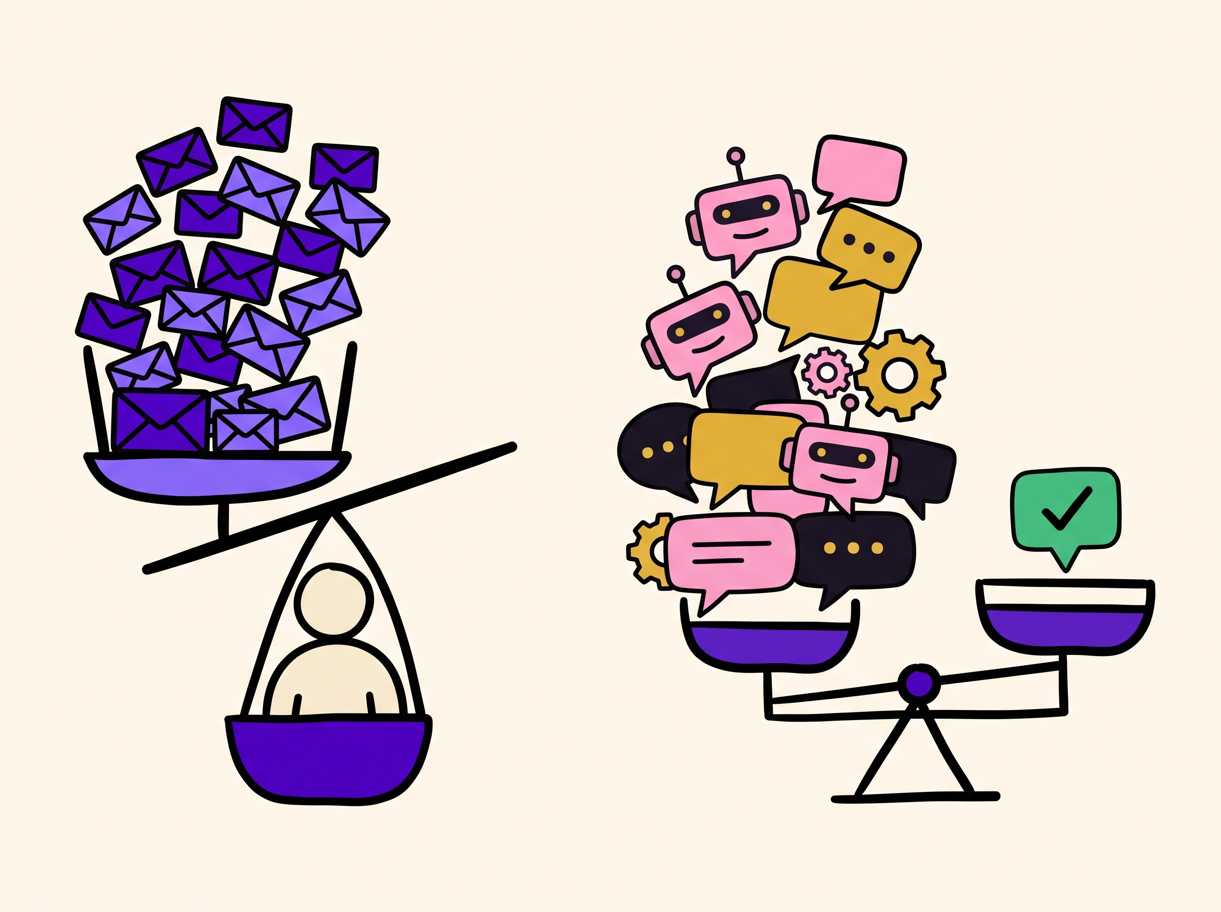
Open three “2026 cold email statistics” posts and you will get three different averages. That is not noise. It is arithmetic.
Most contradictions come from five silent choices:
- Denominator. Reply-per-contact and reply-per-send are different metrics. A four-touch sequence on 1,000 contacts is 4,000 emails. Divide replies by sends and you cut the rate by roughly the sequence length. Divide by unique contacts and you measure what operators actually care about: how many people responded.
- What counts as a reply. Some vendors count every human reply. Some exclude “not interested.” Almost none exclude out-of-office and auto-replies unless they say so. Sales.co’s 2026 analysis of 2M+ emails found 45.1% of replies were auto-replies — nearly half the “reply rate” in a raw count can be machines talking to machines.
- Positive vs. total. A 5% reply rate with almost no interest is worse than a 2% reply rate where a third of replies want a call. Positive reply rate is the number that predicts meetings.
- List tightness. Belkins-style cuts repeated across 2026 roundups show campaigns under ~50 recipients averaging ~5.8% reply versus ~2.1% on lists of 1,000+. Blending those populations into one “average” is how you get a number that describes nobody.
- When the data was cut. Platform-wide averages have been drifting down as inbox noise and provider enforcement rose. A 2023 study is not a 2026 operating target.
So when two pages both claim to publish “the” average reply rate, and one says ~2.1% and another says ~3.4%, they may both be “right” inside their own methodology — and still useless for your campaign until you know which methodology you are standing in.
Cold email benchmarks 2026: a reconciliation table
These are attributed public figures, not Ken’s book. Every row names the source and the measurement choice when the source disclosed it. Checked July 2026.
| Source | Claimed figure | What they appear to measure | Caveat |
|---|---|---|---|
| Instantly Benchmark Report 2026 | 3.43% average reply; top quartile ~5.5%; elite ~10.7%+ | Platform-wide cold email interactions (“billions”) | Strong sequencer sample; denominator detail lighter than operator reports |
| Woodpecker 2026 statistics roundup | ~3.43% avg reply; bounce avg ~5.1%; “good” reply 5–10% | Aggregates platform + third-party cuts | Mixes sources; useful as a map of the debate |
| Sales.co Cold Email Statistics 2026 | 2.09% reply; 14.1% of replies positive; ~0.64% interested | Replies ÷ unique contacts; 2M+ emails, 61k replies | Best public disclosure of auto-reply share (45.1%) |
| Cleanlist Feb 2026 | 3.1% avg reply; bounce avg 5.1%; top 8–12% | Overall averages + industry splits | Industry table is directional; verify against your vertical |
| B2B Data Index 2026 | Reply median ~4% (range ~1–9%); hard bounce target under 2% | 10th–90th percentile bands across markets | Ranges, not a single average — often the honest shape |
| FirstSales reply-rate guide 2026 | Avg ~3.1–3.4%; “good” 5–8%; elite 10–15%+ | Consensus of other vendor reports + signal-based claims | Meta-summary; treat signal-based 15–25% as a different product than bulk cold |
| LeadHaste meeting-booked tiers 2026 | Avg ~0.4–0.8% meetings booked per unique prospect; top quartile ~1.5–3.0% | Meetings ÷ unique prospects | One of few pages that states the meetings denominator clearly |
How to use this table: pick the row whose measurement matches how you report. If your CRM counts unique contacts who replied, Sales.co’s contact-based frame is closer than a send-based vanity rate. If a vendor will not say what they divided by, treat the number as marketing, not a KPI.
What is a good cold email reply rate?
A practical 2026 band for B2B cold email on verified lists:
| Tier | Total reply rate (unique contacts) | How to read it |
|---|---|---|
| Broken | Under ~1% | List, inbox placement, or offer is wrong — fix infrastructure and targeting before rewriting subject lines |
| Typical bulk | ~2–3.5% | Matches most large platform averages published in 2026 |
| Solid | ~5–8% | Tight ICP, real personalization, working deliverability |
| Elite / signal-led | ~10%+ | Narrow segments, strong triggers, or warm-adjacent context — not a fair bulk baseline |
Ken’s operating average across our book is about 3% total reply rate, with about 30% of those replies positive. That is not a promise for every niche. It is what a full stack — list quality, owned sending infrastructure, human-led copy frameworks, and AI personalization with human QA — produces at volume when the offer and audience are already sane.
If you only remember one rule: never optimize for raw reply rate alone. A spike in “not interested” and “remove me” is not a win. Track positive reply rate and meetings in the same dashboard.
Should I benchmark open rate at all?
Usually no — not as a primary KPI.
Open rates on cold email are polluted by Apple Mail Privacy Protection prefetches, Gmail image proxies, and security scanners. You can “win” open rate while losing the inbox, or “lose” open rate while booking meetings. We turned open tracking off on cold sends for that reason; the full argument is in Should You Track Email Opens on Cold Email?.
If a report leads with open rate and buries reply and meeting rates, it is optimizing for a metric the mailbox providers already broke. Use opens, if at all, as a weak secondary signal on warmed conversations — not as the scoreboard for cold.
What is a normal bounce rate for cold email?
| Bounce band | Meaning in 2026 |
|---|---|
| Under 1% | Healthy verified list |
| 1–2% | Acceptable floor for many cold programs; tighten verification |
| Above 2% | Pause and clean — this is the threshold most serious operators treat as a hard stop |
| ~5%+ “industry average” in some roundups | Describes dirty lists and lazy verification, not a target |
Public roundups still quote bounce averages around 5% because a lot of senders still mail bad data. That average is a warning light, not a goal. Hard bounces train providers that you look like a spammer. Soft bounces and catch-alls need a separate verification path — which is why serious outbound runs multi-pass verification before the first send, not after the first blocklist hit.
For the infrastructure side of keeping bounces and complaints from torching placement, see Cold Email Deliverability: The Complete 2026 Guide.
How many meetings should 10k contacts produce?
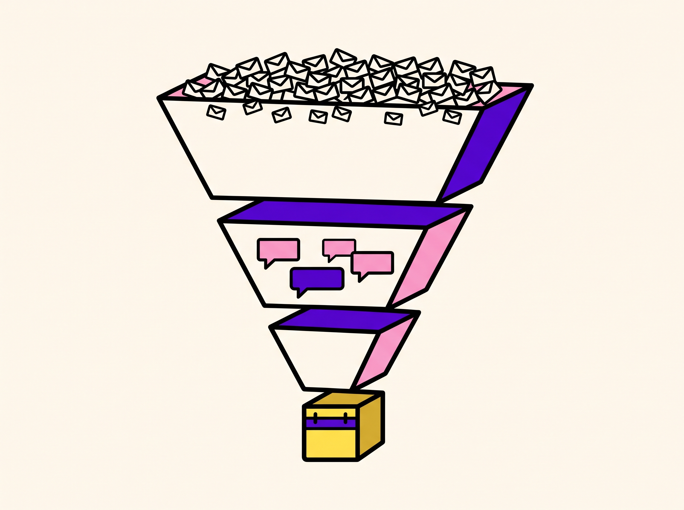
Meetings are where benchmark posts get sloppiest, because the funnel multiplies every upstream lie.
Rough public bands for meetings booked per unique prospect contacted (not per email sent), drawn from operator write-ups such as LeadHaste’s 2026 tiers:
| Tier | Meetings ÷ unique contacts | Per 10,000 contacts |
|---|---|---|
| Below average | Under ~0.4% | Under ~40 |
| Average | ~0.4–0.8% | ~40–80 |
| Above average | ~0.8–1.5% | ~80–150 |
| Top quartile | ~1.5–3.0% | ~150–300 |
Ken’s disclosed book-level figure is about 7 meetings per 10,000 contacts on the programs behind our public benchmarks, against an industry-average reference of roughly 1 per 10,000 on the same comparison table we publish on Why Ken. That 7× framing only makes sense next to the rest of the stack: higher positive-reply share, higher click-through when links are used, and inbox placement that does not silently delete half the sequence.
Two honest caveats:
- Meeting rate is dominated by offer and ICP, not subject-line adjectives. If the product is a bad fit, no benchmark page will save you.
- “Meetings” must mean held or firmly booked on a calendar, not “replied with a vague maybe.” Define it before you brag about it.
Ken’s cold email metrics (with methodology)
We publish these as book-level operating averages from Ken’s outbound system — the same stack behind our agency programs and the Ken platform. They are not a guarantee for every industry, company size, or offer.
| Metric | Ken | Industry reference we use | Multiple |
|---|---|---|---|
| Reply rate | ~3% | ~1% | ~4× |
| Positive reply rate (share of replies) | ~30% | ~15% | ~2× |
| Click rate (when links are used) | ~16% | ~2% | ~8× |
| Meetings per 10,000 contacts | ~7 | ~1 | ~7× |
| Inbox placement target | 80%+ | Many DIY senders sit well below | — |
| Volume context | 1M+ emails/month | — | — |
Methodology notes (read these before you cite us)
- Measurement window: Ongoing operating averages from Ken’s production outbound, disclosed as durable book-level figures on ken.so (not a single one-week A/B test). Treat them as “what the full system produces when offer and audience are already workable,” not as a promise for day-one DIY sends.
- Reply rate: Human replies as a share of contacts in active sequences, in line with how we run client reporting. Auto-replies and pure OOO handling are not the win condition; positive intent is.
- Positive reply rate: Share of replies that express real interest or a next step (not “not interested,” not pure OOO). This is the number that predicts meetings.
- Click rate: Measured on sequences that include links. Many cold sequences correctly omit links; do not force a link to chase this metric.
- Meetings / 10k contacts: Booked meetings attributable to the outbound motion, normalized per 10,000 contacts touched — the same unit as our public comparison table.
- Inbox placement: Target 80%+ on owned sending infrastructure (dedicated IPs, secondary domains, private warmup, continuous monitoring). Placement is a prerequisite metric, not a vanity chart.
- What we are not claiming here: New unpublished cuts by industry, seniority, or company size. If a segment number is not on this page or another sourced Ken page, we have not published it. Do not invent one.
If you need the product-level story behind the stack (human frameworks → AI personalization with QA → owned delivery → iteration order), it lives on Why Ken. If you need the deliverability mechanics, use the deliverability guide.
Metric-by-metric: what to track weekly
| Metric | Primary? | Healthy direction | Common lie |
|---|---|---|---|
| Inbox placement | Yes | 80%+ | “We got opens, so we’re fine” |
| Bounce rate | Yes | Under 2%, ideally under 1% | Shipping unverified lists to “move faster” |
| Spam complaint rate | Yes | Under 0.1–0.3% (provider bulk-sender land) | Hiding the unsubscribe to protect vanity rates |
| Reply rate (per contact) | Yes | Context-dependent; see tiers above | Counting OOO as engagement |
| Positive reply rate | Yes | Rising share of replies | Celebrating angry replies as “engagement” |
| Meetings per contact | Yes | Rising with positive replies | Counting soft maybes |
| Open rate | No (cold) | Ignore as primary | Leading every report with it |
| Sends per day | Constraint | Match reputation, not folklore | “50/inbox forever” without list quality |
For AI-assisted list building and qualification upstream of these metrics, see AI Lead Generation: The Complete 2026 Guide.
What moves benchmarks most — list, offer, or copy?
Copy is where teams spend the anxiety. It is rarely where the leverage is.
Order of impact we actually run when a campaign underperforms:
- Offer. If the value prop is unclear or the ask is wrong, no subject line saves it. We test offers before audiences and angles for a reason.
- Audience / list quality. Wrong seniority, wrong company stage, or unverified emails will look like a “copy problem” in the dashboard. Bounce and positive-reply share usually expose this first.
- Inbox placement. A brilliant email in spam has a 0% reply rate. Authentication, warmup, domain strategy, and complaint rate sit underneath every other number — covered in depth in our deliverability guide.
- Messaging angle. Same offer, different pain. This is where most “creative” work should go once 1–3 are stable.
- Copy polish. Subject lines, length, CTA phrasing. Real, but last. Polishing copy on a bad list is how agencies bill hours without moving meetings.
Personalization depth matters, but only after the email can land and the person is worth emailing. AI that rewrites the same thin template into 10,000 slightly different thin templates does not move you from 1% to 5%. Relevant context on a verified decision-maker does.
How to read any vendor benchmark in under two minutes
Before you accept a number into your QBR:
- Find the denominator. Contacts or sends? If missing, discard.
- Find the reply definition. All replies, human only, or positive only?
- Find the date and sample. Platform-wide 2026 beats a blog citing 2021 Backlinko without context.
- Find the list type. Verified decision-makers vs. scraped whatever.
- Find the incentive. Sequencer blogs anchor near their product’s median. Agency blogs anchor near their sales story. Both can be useful; neither is neutral.
- Translate to your unit economics. Reply rate × positive share × meeting conversion × close rate × ACV. A “great” reply rate on tiny deals can lose to a mediocre reply rate on the right ICP.
Cold email KPI cheat sheet (2026)
| KPI | Rough “stop and fix” | Rough “healthy bulk” | Rough “strong” |
|---|---|---|---|
| Bounce | Over 2% | Under 2% | Under 1% |
| Complaints | Climbing toward 0.3% | Stable low | Under 0.1% |
| Inbox placement | Under 50% | 70–80% | 80%+ |
| Reply (per contact) | Under 1% | ~2–3.5% | ~5%+ |
| Positive share of replies | Under 10% | ~15% | ~25–30%+ |
| Meetings / 10k contacts | Under 1–2 | ~3–8 | ~10+ (offer-dependent) |
These bands are decision aids, not laws of physics. A founder emailing 40 hand-picked peers is not in the same sport as a team touching 50,000 contacts a month.
FAQ
What is a good cold email reply rate in 2026?
For verified B2B lists, treat under 1% as broken, ~2–3.5% as typical bulk, ~5–8% as solid, and 10%+ as elite or signal-led. Always pair total reply rate with positive reply rate — Ken’s book runs about 3% total reply with about 30% of replies positive.
Why do cold email statistics vary so much between websites?
Different denominators (contacts vs. sends), different reply definitions (including or excluding OOO), different list quality, and different sample years. If a page will not disclose those choices, you cannot compare their average to yours.
What is a normal bounce rate for cold email?
Keep hard bounces under 2%, and treat under 1% as the real target. Averages near 5% in some industry roundups describe poor list hygiene, not a benchmark to aim for.
How many meetings should 10,000 cold email contacts produce?
Public operator bands often land roughly 40–80 meetings per 10k contacts at average performance, with wide spread by offer and ICP. Ken’s disclosed comparison figure is about 7 meetings per 10k contacts on our stack versus about 1 per 10k on the industry reference we publish beside it — always check how “meeting” was defined.
Should I track open rate for cold email?
Not as a primary KPI. Prefetch and proxies make cold open rates unreliable, and the tracking pixel can cost deliverability. Prefer reply rate, positive reply rate, meetings, bounce, and inbox placement. Details: our open-tracking post.
What improves cold email benchmarks fastest?
Usually list quality and inbox placement before copy tweaks. Verify emails, tighten ICP, fix authentication and domain reputation, then test offer and angle. Copy polish is last in the queue for a reason.
The only benchmark that matters for your team
Pick five numbers and put them on one weekly page:
- Inbox placement
- Bounce rate
- Reply rate per unique contact
- Positive reply share
- Meetings per 1,000 or 10,000 contacts
Date-stamp the sheet. Write the denominator next to every rate. When a vendor or freelancer sends you a screenshot with a single glowing percentage, ask for the same five.
Cold email is not dead. Unlabeled averages are. The teams that keep winning are not chasing the loudest statistic on LinkedIn — they are measuring the same way every week, on infrastructure that can actually deliver the test.
Want a lighter way to see quality leads without standing up the whole stack tomorrow morning? Ken Daily sends 10 verified ICP leads to your inbox every morning, free forever — useful as a pulse check while you tighten the metrics above.
If you are ready to run the full motion on owned sending infrastructure with human-led copy and AI personalization under QA, start from Why Ken or compare tools vs. done-for-you before you buy another sequencer seat.